The Google Page Layout Algorithm

by Rose

What is the Google page layout algorithm and how does it affect your Google rankings? We show layouts to avoid and advise you what you should do to comply with the algorithm

Google rolled out it's original page layout algorithm on January 19th 2012, and updated it in October 2012.

And at the PubCon Conference in October 2013, Matt Cutts announced that the next generation of algorithms is looking to tighten penalties even further on websites with very little content above the fold.

(Update: It looks like the latest version of this algo was released on Feb 6th 2014).

This algo is actually quite tough to recover from. Lots of sites have attempted to get rid of the penalty by simply reducing the ads and have seen no results (apart from a drop in their income due to the reduction of ads).

There is also some evidence that the algo can't tell the difference between ads and images. The algo really seems to be looking for TEXT above the fold.

What does the Page Layout Algorithm Target?

The original blogpost issued by Google had this to say:

We understand that placing ads above-the-fold is quite common for many websites; these ads often perform well and help publishers monetize online content. This algorithmic change does not affect sites who place ads above-the-fold to a normal degree, but affects sites that go much further to load the top of the page with ads to an excessive degree or that make it hard to find the actual original content on the page. This new algorithmic improvement tends to impact sites where there is only a small amount of visible content above-the-fold or relevant content is persistently pushed down by large blocks of ads.

How does Google assess the content above the fold? It's believed they use image recognition software. Around the time this algo was released, they also had a preview function in the SERPs, where if you hovered your mouse on a link it showed you an image snapshot of the site without clicking through. They've since removed the image snapshot, but are likely still taking them to assess the site.

When Searchenginewatch asked Matt Cutts how it worked, he had this to say:

"It's true that we do have to re-crawl and process the pages to determine their layout and how they've changed. But we're also at the stage where we're still doing off-line processing and then the results of the algorithm are pushed out. So it actually depends on both the re-crawl/reprocessing as well as the offline cycle of computing before then pushing that data."

So this algo doesn't run in real time - they need to assess pages offline. That means that if you get caught out by it, you likely have to wait a while until they next do a batch of offline processing to reassess you.

Layouts To Avoid

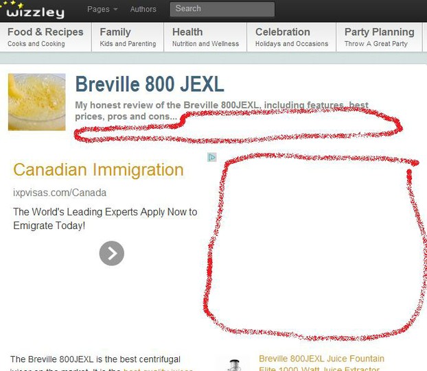
Layout 1


As you can see in the image above, there is very little text above the fold. In fact there is more text in the navigation at the very top than in the first part of the content.

If you have a layout like this, then add text to the description under the title, and add an introduction that wraps around the ad. White space is bad as far as the page layout algorithm goes.

Bad Layout 2

Layout 2


This second layout is more subtly wrong. It actually belongs to me. I thought that as I had an intro, everything was fine - but there is still too little text above the fold.

In particular this page needs more text under the title and above the ad.

Improved Layout

layout 3


The improvement is quite subtle - I've added more text to the blurb under the title, and I've added some more text to the intro to lengthen it.

In total there's about 30 extra words.

Is this enough to beat the Page Layout algorithm? Yes, if it's replicated on every page on your site. Ideally the page would have as much text at the top as the page you are currently reading does, so I might go back and edit some more.

Google have promised that they will be tightening their Page Layout Algorithm even further in their next batch of updates - so don't wait to make the changes.

Is Wizzley Suffering from the Page Layout Algorithm?

wizzley

Yes!

The above image is a screenshot from SEMRush which estimates traffic based on Wizzley's "visibility" in the search results - that is, they look to see how many search terms this site is ranking highly for.

As you can see, it hit an all-time high in December 2011. The Christmas traffic faded back normally in January 2012 - but from the end of January, there is a steep drop, as the page layout penalty takes hold. This is bourne out from traffic to my pages too.

Lets hope the penalty gets lifted as people amend their pages to conform to Google's guidance on having more content "above the fold".

If you can do just one thing, it is to go through your pages and make sure you have used up ALL the characters in the meta description (which Wizzley displays under the title). Having as much text as possible above the ad seems to be important to this algo.

*

Updated: 08/15/2015, Rose
 
Thank you! Would you like to post a comment now?
31

Comments

Only logged-in users are allowed to comment. Login
Tolovaj on 12/04/2015

More content - better chance to get traffic. It's an old truth and it seems it won't change anytime soon.

I don't know, if this is directly related with the theme of this article, but I noticed at two of my sites a traffic from image can help building web rankings of the text (the same, where images are used) too. so it's probably not enough to load our pages with (relevant) text, but we need to find a balance between text and images too.

Digby_Adams on 11/16/2014

These pages were written at the beginning of Wizzly. Then they changed the layout. Many of these authors were quite active once, but I don't think many of them write here anymore. As I see my own pages that look like this, I change them.

Rose on 11/16/2014

Hi WriterArtist - Hubpages is fine. They seem to have carefully laid out their pages to comply with the algo.

WriterArtist on 11/15/2014

This looks quite useful information but is Hubpages adhering to this algorithm? The traffic for Hubpages seems substantial now that Squidoo is out of the competition. Wizzley certainly needs to build its position.

PeggyHazelwood on 09/16/2014

This is very useful information. I'll keep this in mind when laying out my websites.

SeanMac on 08/21/2014

Excellent stuff, very helpful guide.

aswriting on 08/14/2014

This is helpful, I think I have some work to do on one of my sites.

Rose on 05/03/2014

@Sheri_Oz - I've suggested it, but it hasn't happened. I think it's because there's no automatic way to tell which wizzles have intros and which don't.

Sheri_Oz on 05/02/2014

Can Wizzley not send out an email to everyone with old pages not corresponding with the new rules about above-the-fold content? I know they do that when links go bad.

Holistic_Health on 03/07/2014

Good concrete info I an take action on. Thank you!


You might also like

How to Submit Your Website to Google and Other Search Engines

You wrote an article and publish it on the web but nobody visits it. One of t...

My Seven Deadly Sins Of Search Engine Optimization

Search engine optimization (SEO) is not a rocket science, but due its complex...


Disclosure: This page generates income for authors based on affiliate relationships with our partners, including Amazon, Google and others.
Loading ...
Error!