Zazzle's latest blog post (August 2015) about the new store banners is confusing. No matter how I create a banner, it doesn't look sharp. In their blog they ask us to make a banner that is relevant to the store theme. Their example banners are very nice and contain images of products. In order to make a banner like that, do I need to buy products from my store? It looks like they took a photo and then sized it for the store banner.
Although Zazzle says "think about showing an array of your products" in their Creating a Great-Looking Banner post, I don't know how to do this without having the actual products in front of me. We also shouldn't put any text in the banner image because different screen views will re-size the banner.
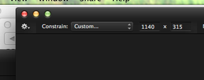
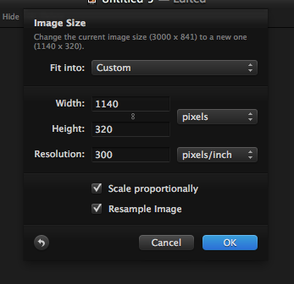
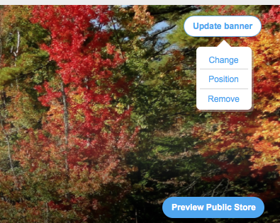
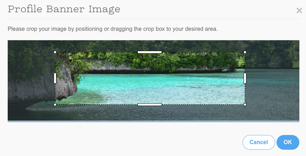
Suggested size is a little greater than 1140x315 pixels. Huh? So my collections banners are exactly that size and they seem to fit okay. The store banners are trickier because our store icon sits to the left side and partially blocks the header. I think the suggestion to go a bit larger than specified is because now the banners can be cropped, so making them a big larger gives us more room to 'play' with the image once we load it up to the Zazzle site.
The store banners have a gradient gray background, which Zazzle says will help the little store icon at the side stand out. I don't really like the gray at the bottom, but we must deal with it.
I'm re-doing this page to keep up with Zazzle's ever-changing platform.




 Farm Tractor Birthday Party Ideas10 days ago
 Fun Dinner Menus For Thanksgivingon 10/20/2023
 Luau Party Theme Invitations and Ideason 10/05/2023
 Preparing a Camper Inside For Travelon 10/06/2023
How are you banners looking?
Wendy, I agree that we must generate our own store traffic. Unless I have an item that is selling well, nothing of mine shows on the first Z landing pages for that item. I still don't know if collections are working for me at all, and honestly it doesn't seem so. But they are a good way to gather the best of like items.
I had hoped to get some referral money from promoting through the collections, but that isn't happening either.
As far as store rankings, mine have gone up, but I couldn't tell you why. It seems my busiest stores have higher rankings, so sales must have a lot to do with rank.
I wish you well with your return to Zazzle - happy (and many) sales!
I'm just returning to Zazzle after a couple of years focusing on other sites. My plan is to load up my stores (my primary print store, first) then concentrate on bringing in buyers by promoting through my blog, website, YouTube, and other sources.
What drove me away from Zazzle in the first place is their constant need to make sellers chase their own tails. This time, I'm not worried about all that. My goal is not to increase my store rankings -- which, from what I'm reading seems futile, at best -- but to generate my own store traffic, working from the outside.
We'll see how that goes. First things first . . . a banner!
Thank you kindly for the info! :-)
It appears to me that they are trying to turn their site into a social media type of site that happens to sell things as well; a high bred of Pinterest and Facebook and Zazzle. Perhaps selling ads of your store is on the horizon?
The idea of promoting other people's product seems counterintuitive for someone who is trying to get their store off the ground. I guess if you have great taste and people come to your store for your recommendations then they might look around at your store.
i will look at the forums. I wonder if this is being viewed favorably?
I am just staring my store and am wondering if I should put the effort into it. Their ranking seems questionable
Nina
No matter how you slice it, we have a lot of work to do for the new things Zazzle wants us to do. With 10 stores, you have twice as many as I do, and I am wondering when I will begin to be caught up with just five. You do nice work, and I wish you well with getting everything done!
Nina, collections can contain a theme such as 'tropical' with all types of items from across your stores (or from one store). I believe that with only one store, collections could be used as categories. My store categories do nothing but keep things organized for ME. I doubt very much that many customers begin at my home page and search from there.
I like the collections for sharing on Pinterest and Twitter, but as I've said, I now have so many of them, that sharing in moderation means keeping track of what I've already shared, and I don't have time for that! And we are supposed to share collections and products to improve our rank. So far, doing that has not improved mine.
@KennedyC, The purpose of the rank is to determine how our stores will be eventually be "factored in to marketplace search results" - read more about Zrank in the Zazzle "news" forum. I've been with Zazzle since 2007 and am a Gold ProSeller, but of all my stores, two of them rank at a 5 and the rest are 2's, 3's, and 4's. It's not very encouraging.
The new Header and overall layout looks like Facebook now. Its a Store it should look like one, not a social network page. Zazzle is a place for individuals to create and buy creative customizable items, there is nothing creative about copying a Facebook look. It was a much better before.
I’m trying to understand this ranking thing, what is the purpose of this?
My store is very organized, not sure if I need the collections thing, still trying to figure that out. Thanks for your feedback, My banner is looking great.
This is so hard for me to understand. I can't find much information on their site either which is frustration.
At this point all I want is one store.
I gather Collections are based on themes, which you determine, which can be anything, eg Xmas cards, just mugs, only t-shirts, photoshops of animals etc. and these can come from any of your stores. Is this correct?
The only consolation is that this change is brand new and everyone seems to be at a loss.
All I want is to get my one store looking descent. Currently is is s mess.
I really appreciate your insight.
Nina
It seems that we need categories less now with the addition of collections, but I have way more categories than collections. Categories stay within each store, but the collections can contain items from all / any stores. Yes, we need both, but I don't agree with Zazzle's request that we have at least 10 collection per store. I have 10 stores and that is a lot of collections to keep track of.
I just have come back to Zazzle and am dealing with all these new changes. Thanks for you informative post...just in time for me.
I still do not understand the difference between collections and categories and do we need both?
Thank
Mira, I've been working on my stores daily, and not a single rank number has gone up.
KennedyC, I don't like that huge banner - it seems pointless. But what I'd really like is if they would stop changing things and finally be happy with how things are for more than a few minutes! We are all struggling to keep up, when we should be doing more productive things.