Maintain a cohesive feel to your website by following through design elements found elsewhere. At a minimum, echo colours and font and little design details such as rounded corners or image borders.
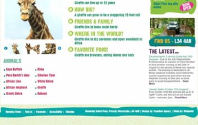 In this Knowsley Safari Experience website (knowsleysafariexperience.co.uk), the wavy background of the footer menu options echoes the wavy lines found elsewhere on the page.
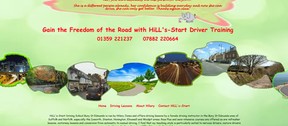
Sometimes, you can use some creativity in getting your message across. For example, in this driving instructor website (drivinglessonsburystedmunds.co.uk), the website header illustrates the diverse types of learner drivers who could benefit from driving lessons with the school whereas the footer illustrates the different types of driving experiences that open up once you have gained "the freedom of the road". Both follow a similar visual format:

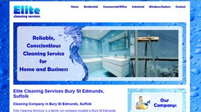
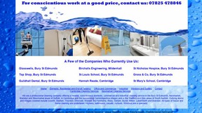
In this cleaning company website (elitecleanteam.co.uk), the header photos rotate behind a central watersplash; in the footer, this water splash is stretched to form the top frame for images depicting the type of cleaning services offered (see section 1 above). Note how the different text sections of the footer are visually separated by using different levels of background opacity.

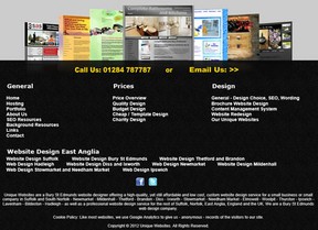 For example, in our own Web Design and Redesign businesss, we give a selection of websites that we have designed at the top of the footer section (one of these websites just might be of a style that catches the reader's eye).
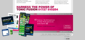 The tonicfusion.com site does a similar thing in a striking, asymmetrical way:
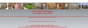 Other sites - like this Ipswich Letting Property site - have a list of properties owned by the company running across the top of the footer:
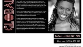 This global7casting.com website shows how a minimal design can be very effective. Note that, in this design, the black background ot the Tel/Fax and Mob boxes serves as a simple but effective visual.
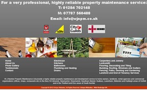
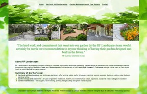 The testimonial given on rflandscapes.co.uk is different on each page - together with the attractive visuals, this helps to end each page with a "feel good" factor.
 This website by pallasweb.com combines a rotating list of the "great companies we've worked with" on the left with an inspirational "let your imagination soar with a website from us" message on the right.
 This routeoneschoolofmotoring.co.uk website puts these professional memberships into a semi-opaque box overlaying a wide-screen road background that mirrors that of the header.
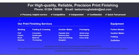 For this burroughsprintfinishing.co.uk website, we gave common mis-spellings of the company name tucked away in the footer so that people could find them by these mis-spellings if they searched for them in Google. We also put the main website keywords into a table that gives human visitors a useful checklist and that gives some extra keywords for search engines.
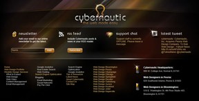 As this cybernautic.com website shows, footers are also an ideal place to link to menu options that you do not necessarily want to clutter up your top menu section - for example, the website pages targetting each individual town/city/state that the company is targetting.

 Gothic Novels and Horroron 09/04/2012

Comments
Good tips, I find it's a good place for backlinks to your other online properties.
Good tips, I find it's a good place for backlinks to your other online properties.
This is a great article, with clear organization and interesting ideas. And I loved the visuals, too.
Helpful information on ways to use footers. Thank you!
I'm going to have to come back and read this in more detail. Thanks for the tips!