|
|
|---|
|
nightowl
|
on 02/16/2012
In conjunction with the introduction of VigLink the tireless Wizzley team has released an updated page layout.
Based on your feedback, as well as consideration for Google's desire to see a good chunk of content "above the fold", we introduced an additional text area beside the first Adsense block. Authors can optionally enter content for this area on existing articles by editing the top-most module which also contains the article title and description. If creating a new page, you will already notice this new entry field.
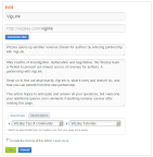
We recommend you enter about 500 characters to fill the space adequately. Ideally, this text grabs the attention of a newly arriving visitor and compels them to read your entire article - so put your best foot forward!
At the same time, we now display the thumbnail of your article image to the left of the title. If you haven't yet entered an article image, now would be a good time.
Lastly, the social buttons (facebook, twitter, etc.) have all moved to a prominent position above the comment section. If applicable, all links will contain your referral code, although in some instances (Pinterest and G+) this was not technically possible.
We think that these improvements should have a positive effect on the overall user experience (and thus appeal to the search engines as well). Thank you Simon and Hans for all your hard work and sleepless nights!
SEO Praxis: Specializing in WordPress Hosting and Small Business Web Design.
|
|
katiem2
|
on 02/16/2012
Great changes, I like it 
Oh yes, just used it and really like it!
Atta Admin 
Katie McMurray
|
|
lakeerieartists
|
on 02/16/2012
Excellent and well thought out change.
|
|
TerriRexson
|
on 02/16/2012
I love it. It's great to see the image at the top, and the new layout is a much better use of space.
It may take me a little while to go back and add an intro to all my articles though! I probably will try and do it though as it's definitely an improvement.
|
|
katiem2
|
on 02/16/2012
TerriRexson: 16. Feb 2012, 17:31
I love it. It's great to see the image at the top, and the new layout is a much better use of space.
It may take me a little while to go back and add an intro to all my articles though! I probably will try and do it though as it's definitely an improvement.
I agree! My plan exactly 
Katie McMurray
|
|
katiem2
|
on 02/16/2012
New Question?
I was playing around with our new toys and added an article image, went back after wizzing around in the draft, to change the image and found it appears as if I cannot.
Is this the case? Once you add the article image its final?
Katie McMurray
|
|
chefkeem
|
on 02/16/2012
Click on the thumbnail image, Katie. Then you can upload a new pic. This may be a bit confusing, I know. Maybe we can add some instructions to that module.
Achim "Chef Keem" Thiemermann is the co-founder of a pretty cool new platform called...um...er...oh, yeah - Wizzley.com. |
|
Digby_Adams
|
on 02/16/2012
This is great. Really like the new page layout. |
|
katiem2
|
on 02/16/2012
Me too I'm having a ball it looks amazing! You guys did a fab outrageous upgrade!
Katie McMurray
|
|
katiem2
|
on 02/16/2012
chefkeem: 16. Feb 2012, 20:26
Click on the thumbnail image, Katie. Then you can upload a new pic. This may be a bit confusing, I know. Maybe we can add some instructions to that module.
I can do that, its really all very easy. I'm thrilled love the changes absolutely LOVE EM!
Katie McMurray
|
|
Art-Aspirations
|
on 02/17/2012
This is a much better layout. Thank you so much for changing it.
Now my article looks continuous, and the ads aren't such a distraction. I like it!
Art Aspirations
|
|
JoHarrington
|
on 02/17/2012
The floating text is great!
I've found that it works differently for Adsense and Chitika. I've tested it here. It floats for Adsense, but the Chitika advert (for me) was longer, so it went above. That's fine though. It still looks wonderful. <3
Thanks for doing this.
|
|
teddletonmr
|
on 02/17/2012
I like it, all the changes are so easy a blind man can figure them out, oK, with a little help. Thanks all for everything you do to improve Wizzley. 
teddletonmr
|
|
Christene
|
on 02/18/2012
Could the Ad block be on the right instead of the left?
-Christene
|
|
chefkeem
|
on 02/18/2012
Why would you find it better on the right, Christene?
Achim "Chef Keem" Thiemermann is the co-founder of a pretty cool new platform called...um...er...oh, yeah - Wizzley.com. |
|
Digby_Adams
|
on 02/18/2012
Christene, why is that important?
I love the way it looks with the change. It's great that the text wraps around the ad when you write a longer paragraph. I bet we'll see a much higher CTR. Please don't keep fiddling with the page layout though. I'm now rewriting 130 Wizzles to take advantage of this and make sure my pages work right.
Unless there's a real substantial reason, moving from left to right or back again, could drive some of us crazy.
I really like the way that there is a thumbnail image on the left and then the Adsense below it. I think it's a great layout that the two are coordinated. It would be less powerful if they were split. |
|
Marie
|
on 02/18/2012
I love the new layout just as it is and am working non-stop right now to update all my pages to incorporate the new area of text next to the google ads.
Loving the thumbnail next to the intro text which I feel will help to entice people down the page - now it's even more important than ever to have great images. So that's another thing that I need to address as well to ensure my articles are giving a great first impression.
|
|
Christene
|
on 02/18/2012
chefkeem: 18. Feb 2012, 10:00
Why would you find it better on the right, Christene?
We read starting from the top left. I'd rather my text to be the first thing visitors see.
When people see add text they might skip over my intro text and move down to the next field. I know I ignore ads, I'm sure I'm not the only one.
-Christene
|
|
Digby_Adams
|
on 02/18/2012
Not everyone skips over ads. My adsense income is proof of that. Since I'm here to make money - I know I'm shameless. I like to see the adsense ads in a hot spot. Because we're in the biz - we don't react to layouts and ads the way civilians do. We become much more cynical.
|
|
Janet21
|
on 02/18/2012
I really like the idea that the white space can now be filled with useful content. That is a great update!
I do, however, agree with Christene. I think the text would look better on the left. When you first view the page, your eyes should go to the text first, not the ads. Comes across as a touch spammy, like the ads are more important than the content. It screams click me, don't worry about what the page has to offer. However, the ads on the left will lead to more adsense $.
Either way works, but my preference would be text to the left if I were going for a more professional looking page for visitors.
|


