 You are staring at a Wizzley page right now. Forget the content for a second and take another look from the point of view of bounce rate. Is there anything here which might persuade you to investigate another page on this website?
I've counted eleven links surrounding just the topmost title. You can visit Wizzley's homepage (twice) or have a choice of the topic category and all the sub-categories leading to Blogging Tips.
Then you get to my profile page, message me, become my fan, look at my articles or peruse my newest output. Clicking any one of them would reduce the bounce rate for either Wizzley as a whole or my own little section of it.
Continue down the right hand sidebar and there are invitations to read other articles. They are contextualized with this one. The wonderful web team here designed it knowing that anyone reading the current article is likely to want to look at others within the same broad topic spectrum. Anyone accepting such an invitation will be lowering the bounce rate percentage for this page.
I didn't leave such important matters to a site template. I had my own welcome to make. Look again at the section headed Understanding Your Blog's Bounce Rate. Right next to it, I inserted a couple of likely links. They are relevant to the article that you are reading. One gives a wider introduction to the same subject. The other provides information on a related field. They would be worth checking out.
(And just in case you did miss that the first time, I've just handed you another link to direct you straight back to it.)
Now scroll down to the comments. If a discussion is in full swing, then there will be an array of links to people's profiles, not least my own. Keep on going and you'll see two tiny links. Here you can print out my article to keep safe amongst your memoirs. Alternatively, if you hate it, you can flag the content and complain about me to the Wizzley team. These are all taking you to other pages. They would knock down that bounce rate.
Finally we reach the footer. It holds nothing but links to the rest of the website. I count fourteen there at the time of writing. They're all necessary and functional, but they could have that dual purpose of navigation to bring down Wizzley's percentage of bouncing readers.
The first time you looked, did you even notice every single one of those invitations to travel further? The secret isn't to merely provide the links, but to make them perfectly integrated to your landing page's content. No-one likes to feel pressured into going elsewhere for all that they came to see. But adding value to your page with promises of more is entirely acceptable. More than that, it should be mandatory!


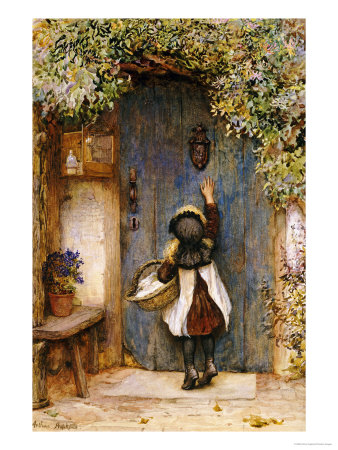
 Anyone can knock on your front door. They could be a postal worker delivering a parcel or a religious evangelist come to save your soul. It could be a neighbor asking if you would move your car or a lost passer-by seeking directions.

 Every website creator has spent hours agonizing over their homepage. Are the colors right? First impressions are always formed by aesthetics; snap judgements made of patterns and pixels. The content is secondary. It might have been the hook that brought them here, but if the page doesn't look inviting, then the words might not even be read.
 You are staring at a Wizzley page right now. Forget the content for a second and take another look from the point of view of bounce rate. Is there anything here which might persuade you to investigate another page on this website?


 You have witnessed how Wizzley and I have worked towards inviting our visitors to view more, but what about other sites?


 St Tydecho's Churches in West Waleson 09/03/2014
 Goodies for an Outlander Premiere Partyon 03/06/2015
 Holocaust Memorial Day Interview with Rainer Höss, Grandson of Rudolf Architect of Auschwitzon 01/24/2015
 Romantic Valentine Gifts for an Outlander Fanon 01/16/2015


Comments
You and me both!
I spend many evenings reading stuff online, while chatting with friends in Skype. As I'm deaf in one ear, I can't differentiate between conflicting sounds. So if we're mid-conversation and a webpage plays a video, I'm not only off out of there, but make a mental note not to go back. Automatically playing videos are the bane of the partially deaf.
And yes, I too have my external links opening in a new window. I think I'm right in thinking that's the default on Wizzley. But I could check with Simon if needful.
I've always had my external links open in a new window. I never want people to leave my web pages (for good) for someone else's. I think video is important and spend time looking for good, relevant videos on youtube. But I HATE it when a video starts playing without me pushing a button or a link. If that happens, I leave.
I'm glad that it's proving to be so useful!
Have to bookmark this. I'll have to constantly refer to the guidance.
You're very welcome!
These are some very useful tips. Thank you, Jo. I'll make time to look at Google Analytics again.
You're very welcome.
All people are different on what they prefer for inter-related links. I try to add specifically related ones, as they turn up throughout the article. Then more distantly related ones at the end. Unless it's telling a sequential story - like with my St Patrick life story, or the Wars of the Roses ones - in which case the next installment goes at the end.
Think like a reader. Where is the most sensible place for your links to go, if you were navigating through the article?
Thank you for all the helpful tips on how to reduce a blog's bounce rate. I agree about making sure external links open in a new window. I also do that for the sources of my images here on Wizzley.
Do you recommend adding related links at the end of a blog post even if said blog post already has tags at the end of it and even if the tags page is accessible in the sidebar? Or should there be some related links in the text of the blog post itself?
I'm proud that I was able to give you that piece; and thank you for your insights here too. By all working together to share tips, we all turn out a little wiser. Plus there's the capacity for wider experimentation to see what works.
I do precisely what you do. I stare long and hard at the best and the worst of my bounce rate stats. Then I try to work out what caused each extreme. You gradually erode away at the mists, in order to determine best practice for yourself.
Thanks for sharing.
Hiya 2uesday! I'm pleased that I was able to clarify it. This is another of those subjects that comes and goes in importance. Sometimes people are advising not to worry about bounce rate. Other times, it's the most important aspect of all.
Whatever the fashion, it's good to know what it actually is! On top of that, I think it's good practice to interlink your articles. Each time you do that, you give yourself a chance to attract a reader to your other stuff.