The 'Gamification' phenomenon has taught educators a lot about how to design and deliver more engaging workshops. In this article, I will trace the stages of developing a workshop. The article will cover idea development. How to take 'newbies' through the paces of creating artwork for products by digitally burning the images to their products. I will also talk a little about the intricacies of marketing to, and with, a sustainable sharing community developed around and attractive strategy.

How to Plan, Design and Manage Workshops
by Jo_Murphy
If you have a message to share, running workshops can be a great way to communicate with others. Developing a solid attractive workshop takes planning, scaffolding and staging.
How the Idea for the Workshop Came About
Engagement is an Escalating Phenomenon
I am a teacher who has taught in various institutions ranging from pres-school to aged care. I have mainly taught in schools, aged care, universities, and care centres such as prison, rehabs, and refugee centres. My main areas of study have been Visual Arts, English teaching, Curriculum Design and now ESL or TEFL.
This workshop has been a pilot test of an idea about gamification. The workshop capitalises on jigsaw creation as a way of bringing challenge into the simple act of card giving.
The experience of running the workshop has allowed me the luxury of reflexion on the effectiveness of the activity. Running this test allows me insight through which I will polish up the idea, further tweaking the workshop design.
At the end of what is quite a long testing process a neat "package" will be developed.
Here are the stages of polishing the design.
- 1. Idea development
- 2. Scaffolding (onboarding)
- 3. Curriculum Writing
- 4. Testing in the real world
- 5. Gathering data
- 6. Tweaking
- 7. Repackaging (and on and on reflexively until ready)
- 8. The real launch (ongoing reflexion)
Yesterday, I gave a workshop at the Southport Library. It was about testing every aspect of the workshop. The fact that only one person turned up told me heaps! It told me that my marketing was off, and that I need to explain to prospective participants what the workshop is about.
Was this project a failure for me? Absolutely not! I was able to test the workshop with this one participant. The feedback I received has told me everything I need to know to get the project onto it's training wheels.
Onboarding and Scaffolding
Essential Elements of Workshop design
The workshop was developed from two areas of my personal experimentation and investigation.
The idea was loosely clustered around the idea of gamification and engagement. The longer players are engaged in the game, the easier it will be to build community. So the idea of creating jigsaws from the artwork we make is attractive. Not only this, it is easy to transfer the skills used to make jigsaws to creating other products such as real jigsaws, mugs and functional or decorative products, the likes of which you will find on Zazzle.
Here is the first cluster of ideas for the work shop. How To Make a Digital Jigsaw Card. You will see that the workshop had a sound technical basis. Yet I was not convinced that I was going to be able to get the participants designing their work quickly enough in one session to leave them with enough "take away knowledge".
This is where teachers and workshop designers have to think strategically. How would I be able to get the participants drawing quickly enough so that they were able to take a way a finished product from the work shop?......By Scaffolding.
The word scaffolding means exactly what it sounds like it means. It requires the teacher or workshop designer build enough structures around the techniques participants are required to learn so that they can build on small incremental steps, one at a time. I have achieved this by having three videos arranged so that they step through the process.
Then I need to 'onboard'.
Onboarding, is a game designers way of easing people into a game so that they are not scared off by the initial level of difficulty.
Onboarding requires that the participant
- can see the scaffolding so that they feel as safe a child on a bike with trainers wheels
- is motivated because he or she knows there is an attractive product or experience to be had at the other end of the learning curve
- is drawn into the game and becomes 'converted' to it as a loyal fan
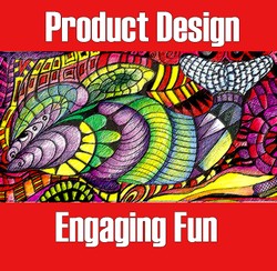
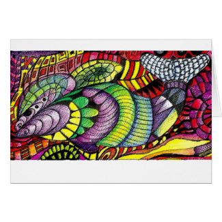
To accomplish the trifold feat, I chose to teach the attractive and yet simple technique of Zentangle. Here is the article I used to introduce the idea at the workshop. How to Zentangle.
If you read the article you will find that all of the instruction is contained in the videos embedded into the article. I like Tiffany Lovering's video's because they are accompanied by music to help the students concentrate.
Peacock Zentangle
Tiffany Lovering
Being Totally Prepared
Only a proto-test will tell you whether you have thought of everything
I was extremely well prepared on the day of testing. We thought the there would be five participants, so I brought ten sets of pencils with marker pans in zip lock bags, and sets of tracing utensils available. I had a scanner, but as well, two digital cameras in case there was extra need for digitalizing equipment. The content of the workshop was ready in the form of printable articles and there were speakers so that the relaxing music could be piped into the room.
Everything was ready but it was still an experiment with regards timing and in understanding what the needs of the students would be.
I had written the books Global Citizens Creative Arts Text and Virtual & Traditional Jigsaws in the Classroom.

I had done an enormous amount of research and yet still wasn't quite sure how this would go. Try a free sampler of the book.
Because I had only one participant who told us that it was very unclear what the workshop was about, we decided to really work on the advertising and re-run it in June. 2014.
I have decided to change the complexity of the Zentangling task by cutting the pages down and by use thicker felts. This will speed up the process. I will also have thicker crayons for younger children, just in case they are there. If we can cut through the workload, we will arrive at the computing section of the workshop more quickly. This will gives us time to look at the jigsaws once they are made and to critique them so as to improve the look and feel of the art.
We will then be able to play with other products besides jigsaws.
I have also decided not to bring a scanner next time and only to use the digital cameras to snap the images blue tacked to the white board. (Time is too precious to take it up scanning)
Having said this - the workshop has let me know what I needed to do to better prepare before making up packages and circulating advertising. I can now think through various aspects of communication and keep tweaking them until the next time.
You might also like
How to Make a Digital Jigsaw CardJigzone.com offers a free facility through which you can turn your own artwor...
Nautical Jigsaw Puzzles: Ships and the SeaNautical jigsaw puzzles, with themes from the sea, are fun for children, teen...
Puzzles: An Activity Worth RediscoveryCompleting a puzzle is a good defense against boredom. And it can have other...





 As We Age - We React to Life's Challenges Differentlyon 03/16/2024
 Organic Gardening - Cunnamulla Styleon 03/08/2024
 Cunnamulla - Premium Destination Outbackon 12/17/2023
 OpenAI and Watermarkson 02/06/2024
Comments
We studied it as kids at school.
"Eyecatcher, in architecture, is a costly, generally nonfunctional building erected to enhance a natural landscape" Very extravagant.
There's some non-purpose-built example that currently eludes me.
The only example may sound non-purposeful in its name but perhaps not in its reputation.
Might you be acquainted with the folly style in French architecture?
French architects offered their money- and power-holders the maison de plaisance (house of pleasure, literally) known as une folie, because of its extravagant style and/or unexpected location.
But la folie of the 14th through 19th centuries perhaps seems not at all non-purposefully built even as they served as retreat and weekend venues. But at the same time perhaps it seems non-functionally built because there would have been more practical, more streamlined ways of styling it.
How would you view la folie (also translatable as the madness!)?
I am still tryin g to think what a non-purpose built piece of architecture would be.
Thank you for the link!
What's not to like about an artist who has perhaps his canine sentient scampering around -- with his tail up, to show his happiness -- as the kinetic sculpture settles into place?
I proved myself wrong. They serve the purpose of moving sand!
I think sculptures that walk along the beach are non-functional. Unless you got picky. They serve the function of furthering the art of kinetic sculpture
https://www.youtube.com/watch?v=Pj-Nq...
Thank you!
Functional makes sense!
Might you have any idea what non-purpose-built would be in the way of architectural examples and what its non-functionalism -- ;-D -- would look like?
purpose-built
I guess we once would have called it functional?
The Gold Coast Cities site has a picture of Southport Library as a structure in line with what they're building here in the way of predominantly glass-walled buildings with a complete first floor and a partial second floor under high ceilings.
Their write-up mentions as amenities
• Accessible parking
• After hours return
• Community meeting room
• Community notice board
• Defibrillator
• Disabled access and lift
• Internet access
• Library café
• Local Studies Library
• PCs with Microsoft Office
• Photocopying, printing and scanning to USB
• Self-serve checkout points
• Free Wi-Fi
It notes that "The current library, which also houses the Local Studies Library, provides a range of flexible spaces for library services, events and meetings. It has a café and outdoor courtyard."
It observes that "The library was moved to Lawson Street in 1968, Australia Fair Shopping Centre in 1985, then to the current purpose-built library in 2002."
The phrase "purpose-built" seems quite popular these days among Unitedstatesians.
It was surprising to find it -- since I think of it as a Unitedstatesianism -- on an Australian site. Would you have any insight into its meaning and popularity?
Yes. You know now that I live way out here in Cunnamulla - I haven't been there for a long time. But I am going there in April. I might just have a cup of coffee there.