Pimp My Wizzle Formatting Concepts I've Figured Out With The Extraordinary Tools At Our Disposal

by Jerrico_Usher

Wizzle building is an incredibly addictive sport. I say sport because of the toll it takes on your mental state but you have a great deal of fun! Learn Some Formatting Techniques

When I enter a site with great tools to play with, I just can't help experimenting and seeing what I can do with them. All I see are resources all around me. It's this degree of curiosity and resourcefulness that makes Photoshop (image manipulation), Audition (audio manipulation), and Camtasia (video manipulation and creation) so powerful and useful to turn what's in my head into a 3D experience for my patrons (anyone who reads/visits my pages, videos etc...).

I've taken the time to understand HTML pretty fluently, and java script to some degree so I can understand how every individual resource in wizzley's editor toolbox behaves and how to make things happen that aren't always obvious. In this article I'll talk a bit about how readers perceive your article and why the aesthetics and quality content are both equally important, in a good balance, of course. Then I'll show you some of my "creative uses of the modules and features of the editor's creations/templates in my own work in the past 6 months. I scoured every article I've written and cherry picked all the formatting techniques I used.

|██████████████████████████████████████|

Pimp My Wizzle
Pimp My Wizzle

Before We Get Into The Pimping Of The Wizzles...

Some background and insight into a customers perspective (through my own as a customer/reader)

Hubpages was my first sandbox and I learned a great deal, especially because there were some limitations I couldn't understand (why they were implemented) like not being allowed to put an image to the left!

Wizzley, on the other hand, offers me a new playground to sculpt some amazing articles that are chiseled in artistic aesthetics- a personality if you will, that is, in my opinion, just as important as the quality content your dressing up. The content appeals to the readers analytical left brain, but you can't neglect the right brains playful nature. It's a bit like putting the kids in the Gym daycare, you go to work on the gym equipment and tone up your vessel through life, meanwhile your creative, exuberant, curious, and a bit entitled to some nice wall paper to get excited about, side is in being taken care of and playing with the visual toys.

This is not to say the right brain is a child, just that it exudes child like exuberance in it's nature. It's creative and loves seeing new things, enjoying great colleges of art, and is the side that makes people really immerse themselves into the dance of words and pictures, formatting, and excitement you felt when you wrote the piece!

Just imagine how you felt when you saw "The Matrix" (assuming you did like it). The movie was a psychological thriller and the concepts alone were mind blowing, but add that layer of effects and the philosophies come alive.

The actors push you into the world deeper (i.e. formatting in wizzles to readers). I've collected a few ideas and will share them with you below. I will update this as new things come to mind. I will also use this page to copy paste the effects (lines, boxes in text, etc... you'll see).

Don't Overdo The Formatting, However...

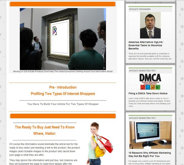
Or people see your wizzles like THIS GUY (love the fish tanks in the shoes!)

|██████████████████████████████████████|

A good article pleases both sides of the brain

It stimulates the reader's intellect, answers inquiries they had, and entertains their mind with beautiful aesthetics that make them feel important and at ease, even excited. It also should have a built in braking system. The mind races and needs help breaking to absorb the information and process it.


Too many words in a row and the brain sees work. Paragraphs that go on for miles with no aesthetics or imagery to immerse them into the plot and they see homework, not enjoyable reading and an immersive experience they are after. Even someone wanting to quickly research something wants to quickly identify with the information and formatting as well as context (quality writing) helps them do that. Remember we're writing but also servicing our readers!

Your account is like a cable station channel (author acct) on a larger network (wizzley). You create the programming but aren't the only channel on the web! Your programming brings them in through word of mouth and other venues, your monetization is the television commercials.

Competition is not just about SEO it's about getting people to interact and react to your article. Web 3.0 is all about this. 2.0 took us from 1 dimensional sites to interactive ones, 3.0 is going to take that to the relationship level- where customers (readers are potential klickers (misspelled on purpose) will make purchasing decisions based on real informative value and relationships with sites that bring them well built pages.

If I research on a Wizzley page and my experience is potent- I got what I needed succinctly and in one page, I'm definitely going to bookmark that page so I can find more on this site when I run into a research need. 

Formatting can also draw out the context of the article more and further immerse them into the information. The synergy of a great article is designed to fully immerse the reader in an experience not just boring research. There is a balance but also keep in mind that some minds enter your page after a lot of disappointing pages or simply a lot of reading across several pages.

|██████████████████████████████████████|

books

Beautifully Bound Book Or Folder Full of Black And White Pages?

Think of it like this. Would you rather write a book and sell it as a bound book or a folder with printed out pages of the book and no pictures? See where I'm going with this?
A good article allows their mind to easily discern your content by good use of space around things, lines to break up blocks of text, no more than 6 lines per paragraph, using formatting techniques, and so on. There are a lot of bad (aesthetically) pages out there with good information crammed together in black and white. People like dynamic and vivid colors, well laid out formatting that makes your article 3D in appearance.

We're in the Pintrest age of a sort. Sites are starting to convert to a more aesthetic appearance and this is a great opening for your wizzles to shine! Your article should also tell the story both in images and formatting that the words tell. The aesthetics are an external shell of your article, a container if you will, and it can draw someone in deeper who wants a richer experience in reading articles. Magazine like pages are vibrant and built with the reader in mind.

With that I try to make my Wizzles shine, look professionally polished and attractive. Formatting I use is designed to excite them and draw their entire consciousness into the article. Some people may not even read the article and may simply scroll slowly through your page just to see your formatting! That's time on a page, and they may be potential earners for you if your Amazon module image provokes their sense of urgency to purchase something!

██████████████████████████████████████

__________________________________________________________

Part II: Tricks In Formatting For Aesthetics And More

__________________________________________________________


██████████████████████████████████

The rest of this article is going to walk you through some techniques I use, then it will assume you understand the concepts after seeing the breakdown (image explaining how it was created) and will start showing you samples from many of my pages where I created some interesting text effects and line break effects to hopefully give you some ideas for creative formatting of your wizzles.

These techniques use all keystrokes/text/underlines etc... to generate their "compartmentalizing" effects so this won't slow the page load much, the images if you decide to use them too may but you already add images right?

Enjoy, I spent 8 hours building just this section for you. 

Comments appreciated!

The Line Break

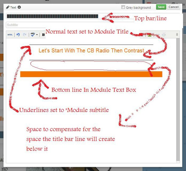
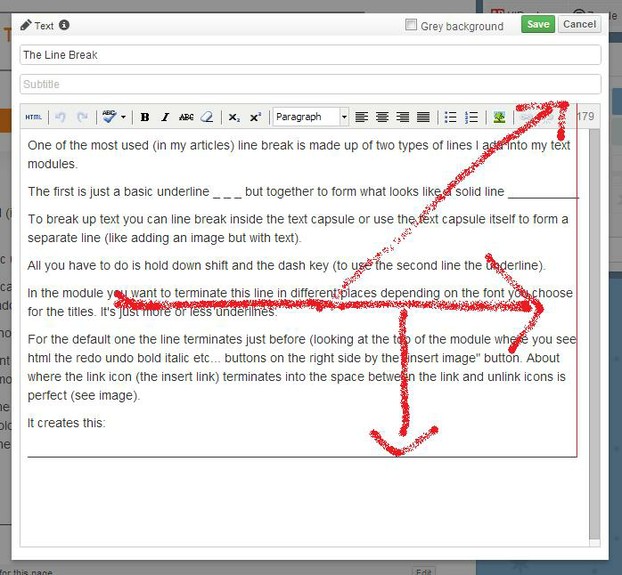
One of the most used things (in my articles), is  line breaks. These are made up of two types of lines I add into my text modules.

The first is just a basic underline _ _ _ but together to form what looks like a solid line __________

To break up text you can line break inside the text capsule with one of these or use the text capsule itself to form a separate line (like adding an image but with text).

All you have to do is hold down shift and the dash key (to use the second line the underline).

In the module you want to terminate this line in different places depending on the font you choose for the titles. It's just more or less underlines.

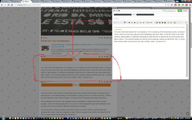
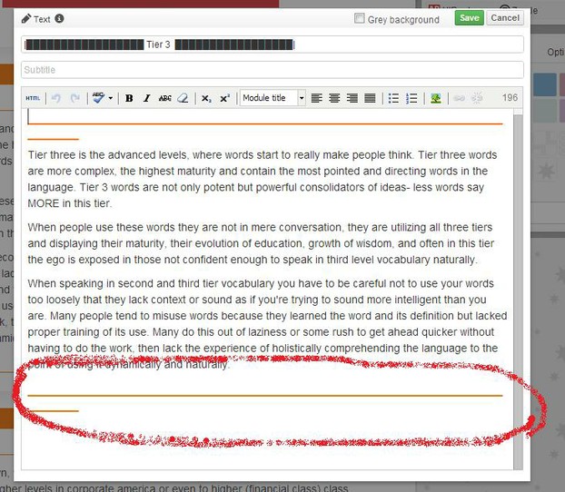
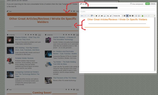
For the default one the line terminates just before (looking at the top of the module where you see html the redo undo bold italic etc... buttons on the right side directly before hitting the word count first number.  (see image).

It creates this:

_____________________________________________________________________________

For a basic line break just use a continuous underline until the line is in the position below apx.

Bold Line

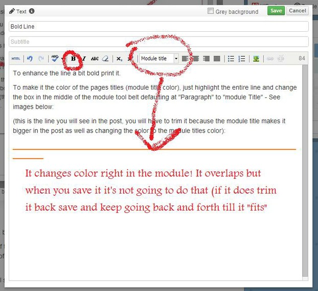
To enhance the line a bit bold print it.

To make it the color of the pages titles (module title color), just highlight the entire line and change the box in the middle of the module tool belt defaulting at "Paragraph" to "module Title" - See images below:

(this is the line you will see in the post, you will have to trim it because the module title makes it bigger in the post as well as changing the color to the module titles color):

______________________________________________________________

Module Title Effects

2
2

There are two modes to this. Module Title and Module Subtitle. The module subtitle is going to essentially be slightly more robust than bold printing it but it also gives it a faded appearance that looks great under a colored heading/title.

You can play with it to get it the way you want for your particular needs.

keep in mind what you see in the module text box isn't always perfectly accurate with what appears in the page (considering you're in full width mode). The line break example shows that. It overlaps in the module but not on the page.

You can get different effects in bold print mode for each line type (module title or subtitle). If you use bold while the Module Title is set for the line, it will cancel out the color and display an h3 sized line that's bold printed. So if you want the cool color effect you have to assure the bold is off.

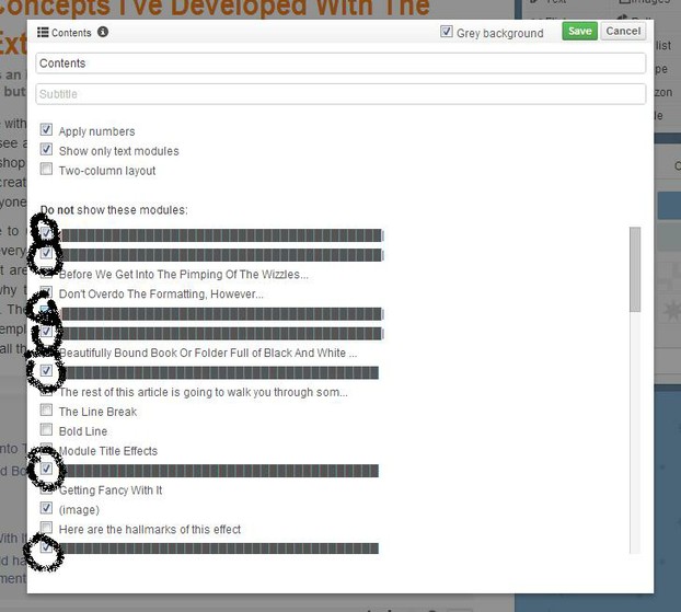
You can also use this in any module that allows you to put in a title. In an image module you can just copy paste (or manually redraw) the line AS the title but make sure if you use a TOC in your article you're checking the boxes next to any modules with lines or your TOC will be a mess!

g

██████████████████████████████████████

Box Line

The classic underline is great for breaking up large blocks of text and enhancing images by it (by contrast) But A Box Line Is Cool Too! I discovered this on someones profile on Hubpages. It was simply an Ascii character you could insert (and the modules accept) to create a basic cursor looking block. I don't know what creates this I just copy pasted it and like the underline just put it side by side over and over again until I had the right line size. here is the character:

It can also be module titled/colored in your post bringing a neat effect to break up sub-chapters of your longer articles.

In most of the fonts this line is a seamless line break. You can't see several boxes with lines, but in a few this is what happens. I got creative with those but that's another effect I'll explain in a moment.

Here is what it looks like in the perfect size to max out the width of the page:

██████████████████████████████████████


If you want to center it don't put it in the title field of a text module, put it in the text box (main content box in the module) and use the center formatting in the tool bar to center it like any other text.

██████████████████████████████████████

Getting Fancy With It

Here are some renditions of keyboard combinations I came up with for various articles I've written...

1. 

████████████████████████████████████████████████████████████

(in this you see the boxes but it's kinda neat anyway!)


2. 

██████████████████████████████████████


3. 

||█████████████████|███████████████████||

(this one uses the line character over the backslash key to create an effect like that. I vary this one by changing where that middle line shows up to give a visual effect)


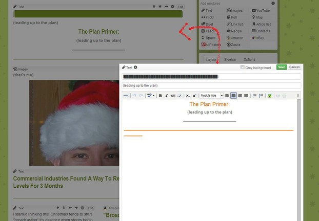
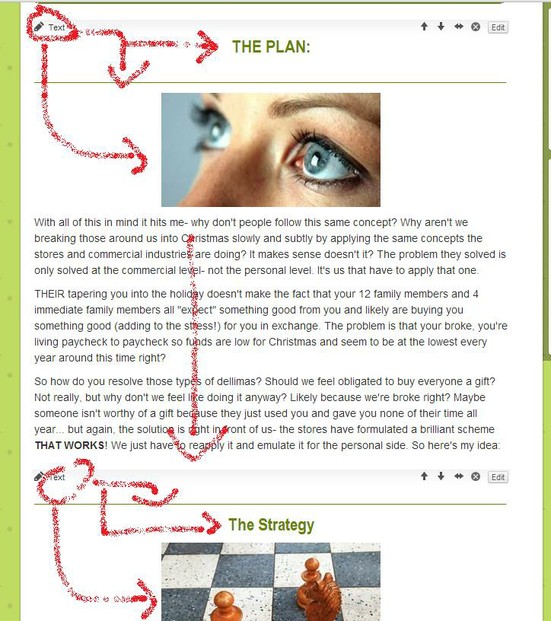
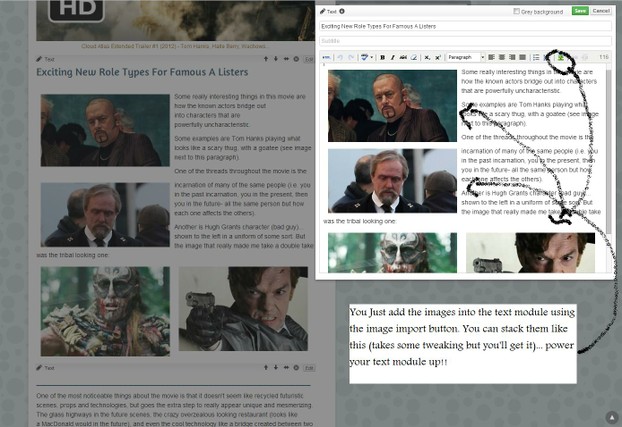
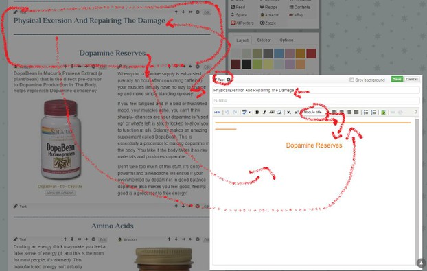
4. (see image below)

(image)

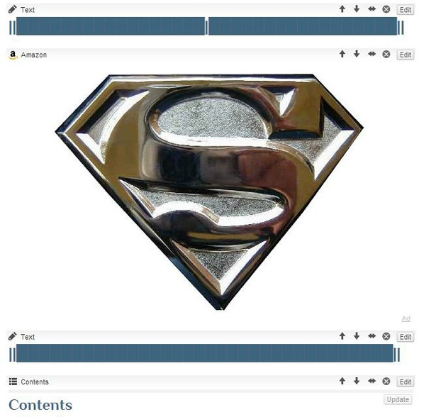
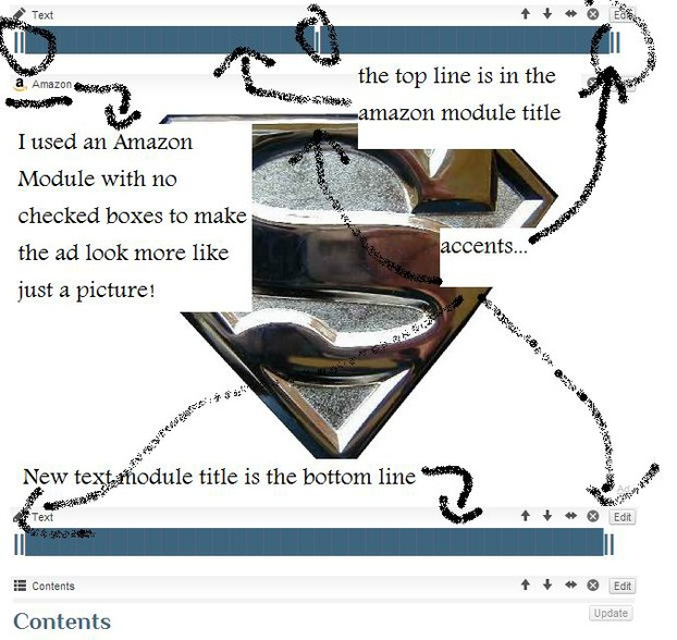
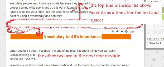
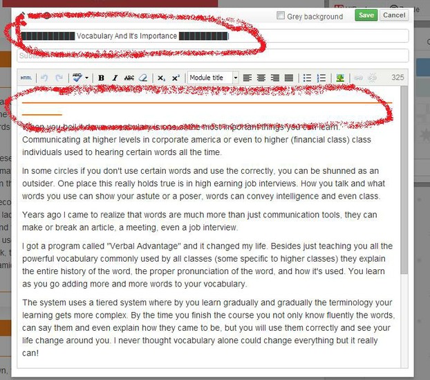
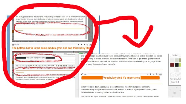
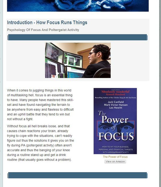
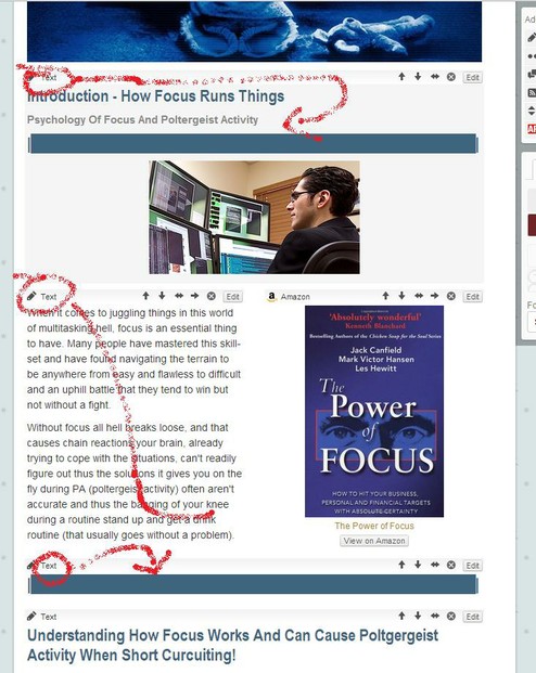
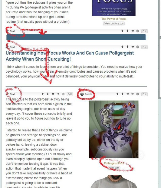
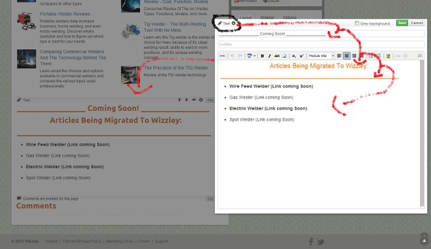
example on one of my articles... this is in edit mode, see how the two lines are part of two different modules?
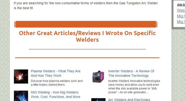
Here are the hallmarks of this effect

Here are the hallmarks of this effect
g

██████████████████████████████████████

__________________________________________________________

This Is Another Neat Way To Create A 100% Text Title

__________________________________________________________


██████████████████████████████████████


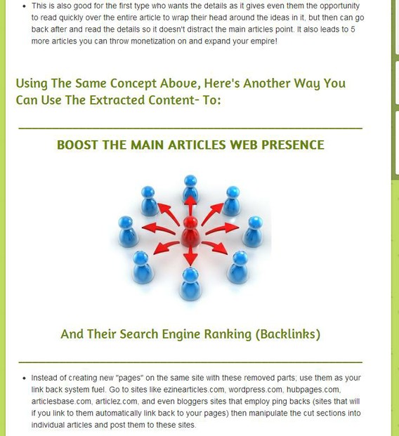
The above effect is just clever text macrolling :)

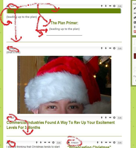
Here is how it's broken down:

2

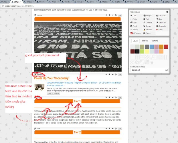
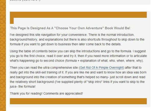
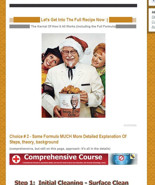
Example how a 3D image and lines complement (enhance) one another

That's a pixabay image I used there!

Breakdown of the effect

Breakdown

Effects can be created by simply experimenting with visual concepts like I did above. At the end of this article I'll list all my articles with effects in them (one per effect) so you can see how I did a lot of mine. I try to create a new feel every time and you can do that even using the same effects, with different images. I experiment with moving modules around, adding lines, and more.

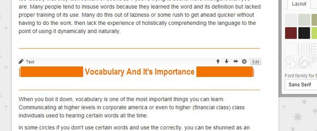
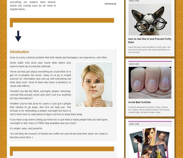
This is a sub-header example in the above article

Headers
7

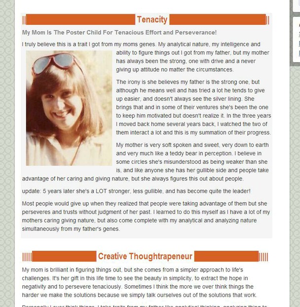
How the subtitle with thin line and title was formatted (above image)

You can also do this effect by putting the title bar line in the content box, setting it to module title and centering it
9

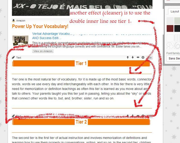
A cleaner effect is using two inner thin lines to give the text that roman feel

0

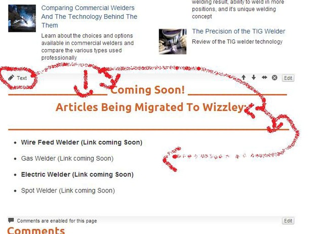
Using lines across two modules

effect
effect
00000

The top line is the bottom of the last module as shown here

78

The bottom half is in the same module (thin line and thick boxy title

65
21

using grey background, aforementioned techniques and products to make it 3D and easy on the eyes

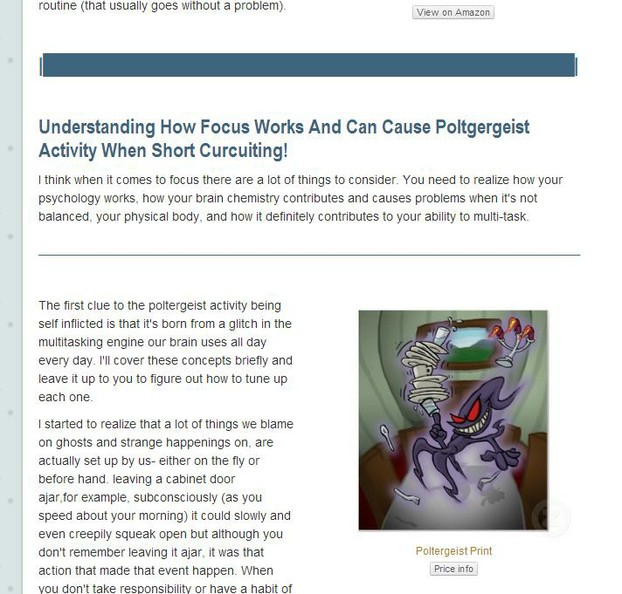
poltgergeist

breakdown

bg

If you have to split a text module into two so you can add the side panel of ads, this stiches it up nicely

0000000
rere
23
23

breakdown of top section

43
pixabay images!
pixabay images!
brkdwn

(Image example)

ghi

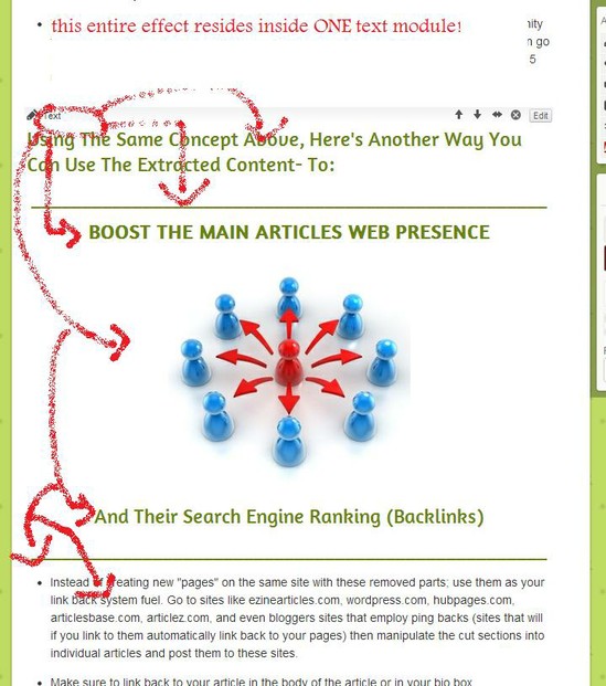
This entire effect is inside ONE text module!

def

Line Break Effects For Ad Wrapping

sdf
adwrp

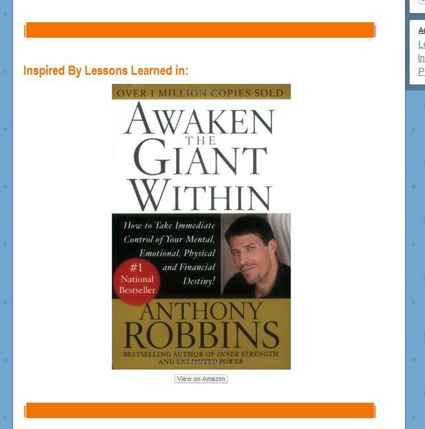
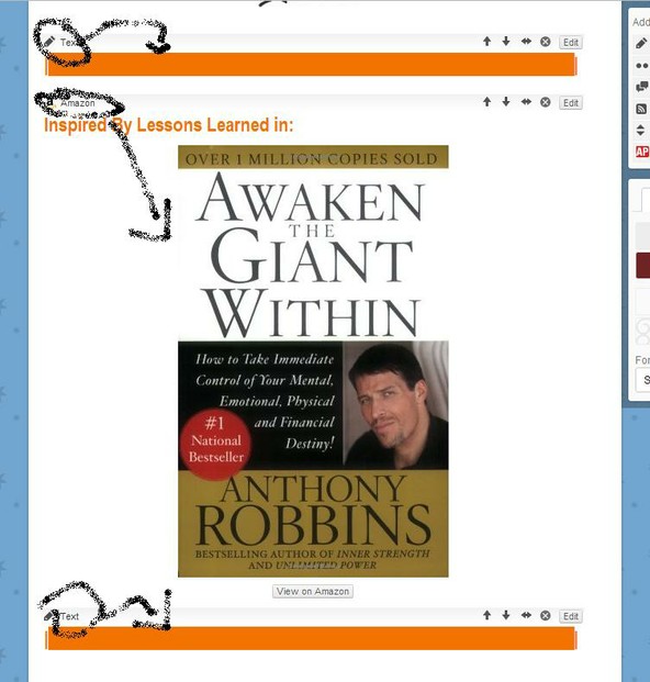
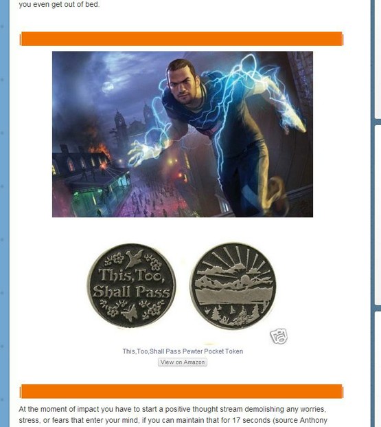
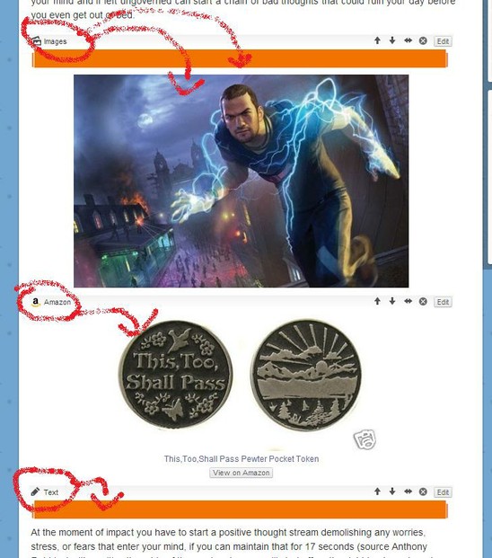
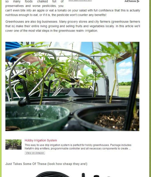
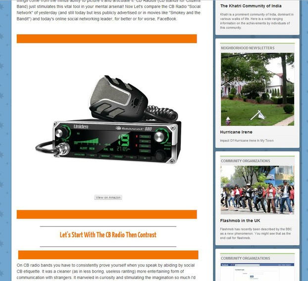
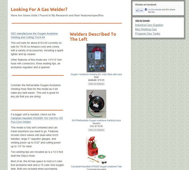
Image module and amazon module wrapped in block lines

The image was added above the amazon to enhance their image
dfg
h
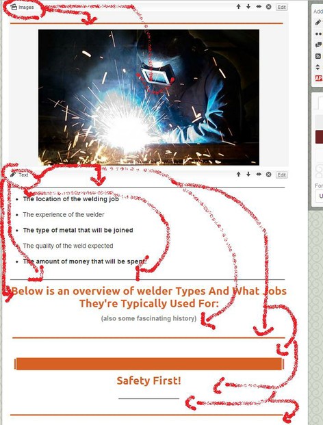
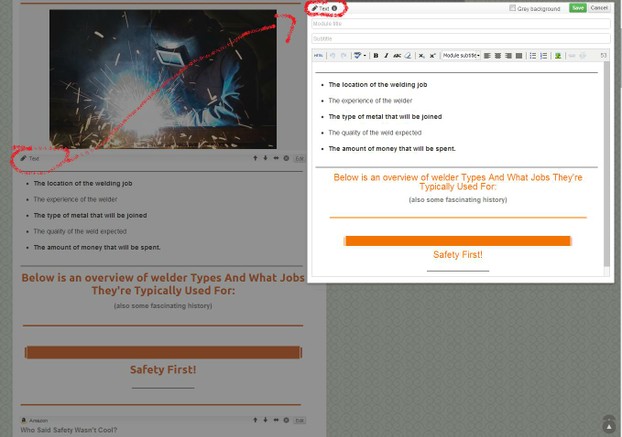
aweld
w

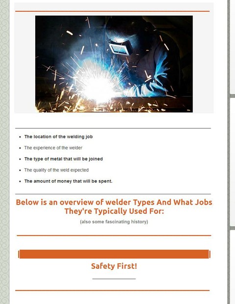
It's amazing how much you can do inside a text module alone!

dfg
z
zz
cc
f
g
e
g

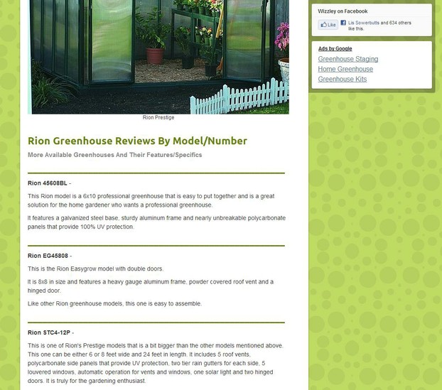
Example Of A Set Of Modules WITHOUT the Block Line break/wraps...

d

Example Of A Set Of Modules WITH the Block Line break/wraps...

See how much depth 3D was added with a few simple block lines added?
Drastic Difference yes?

_____________________________________________________________

Side By Side Comparison

_____________________________________________________________

Before

Before

After

After

_____________________________________________________________

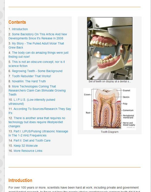
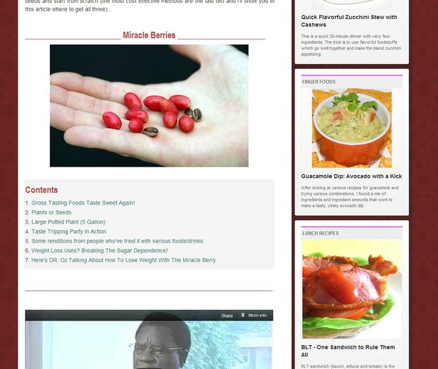
Example Of Images Beside TOC and Line Breaks At Top And Bottom

the skinny line breaks at the top and bottom are in individual text modules for each line... adds nice space around the TOC too!
Contents WIth Images Example
CB
f
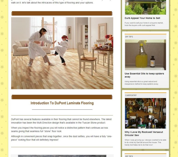
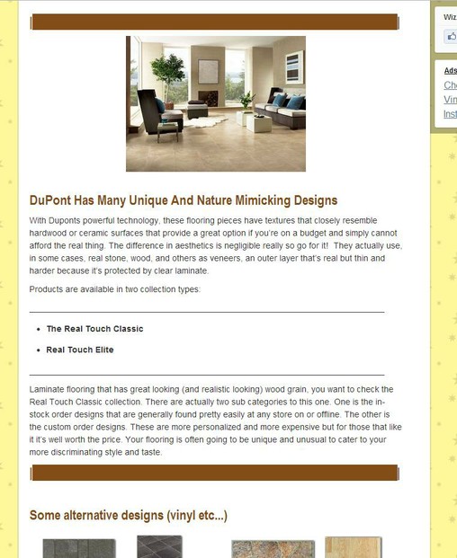
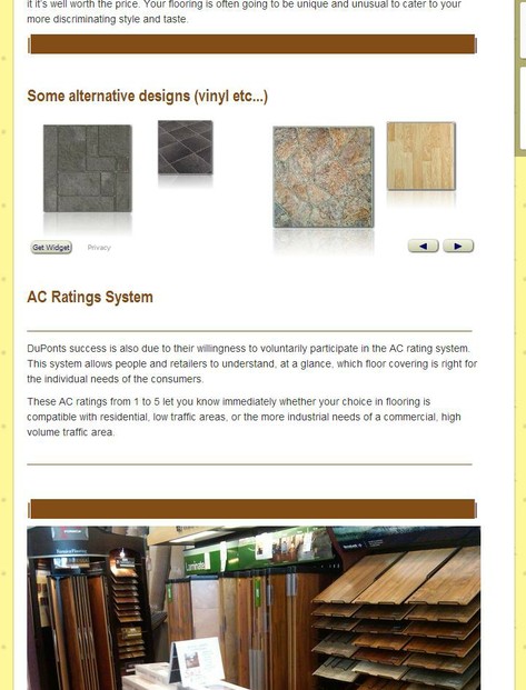
dupont
d
a
b
c

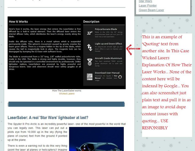
Example Of Quoting Without Putting The Words In The Article (where bots can read them as dupe content)

You can dress your quoted content up in photoshop before inserting it for a powerful aesthetic effect!
v

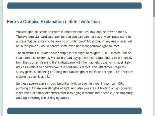
Second Example of quoted text imported as an image (screenshot and crop then import).

This was put into my wizzle as if I were going to include it, dressed in "bars" then screen captured and brought in as it was- only as an image not text
a

Even Just Adding These Lines Every Couple paragraphs Or To Break Up Points, It Makes It Less Busy To The Reader

g

The dotted line can look cool too bolded and Module Titled (h3)....

cursive fits best with the dotted line

An example of an elaborate scheme but still looks great

p
a
a
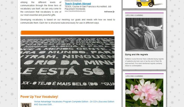
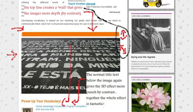
3D Layering of Text Lines/Boxes

3D (and the best part is these lines don't cause the page to load any slower, google can read around them, and they add impact!

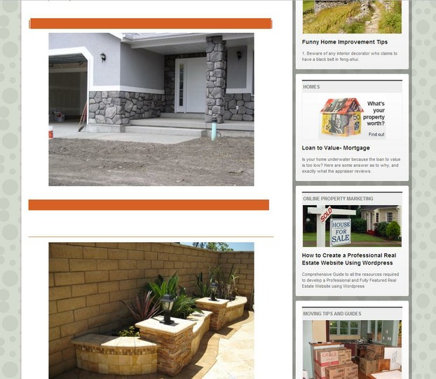
Big picture at the bottom, normal text and lines, and small title text with lines gives this an optical illusion of 3D Effects!
a

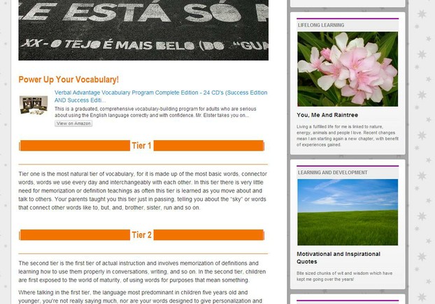
Lines shorter than the title phrase gives an effect as well that can pimp your wizzle :)

d

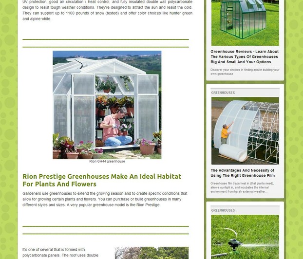
Example of thin lines wrapping subheadings for simplicity and aesthetics

a

Same bars with a picture that has rounded corners

Gives an effect as well...
o
o
m

This has a subtle "transportation" effect to it. The top bar is solid, the bottom cut through with words and on the outsides what looks like wheels...

b

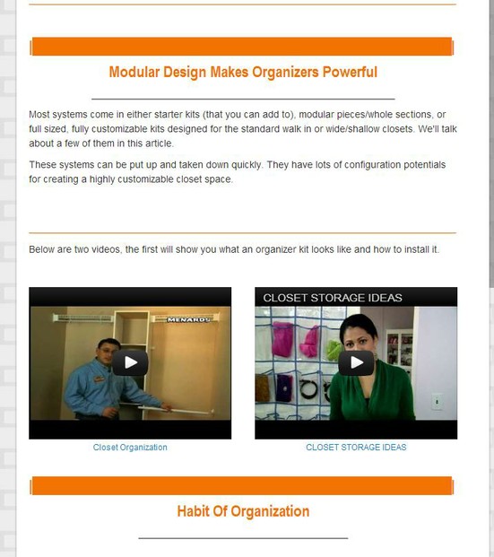
example with side by side videos inside the bars/section

As you get creative you start to blend effects into cool collages! SEO compliant!
.

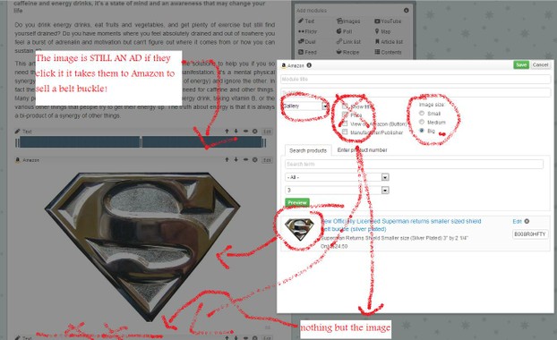
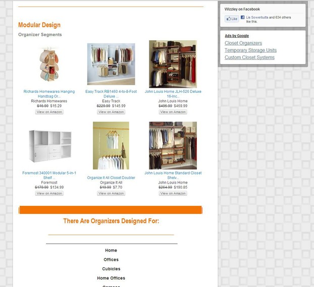
example of showcasing amazon ads in bar designs, gives it depth and feels less like an ad

0

Creative Schemes

100% Text Module and text
b

Since we have no frames around pictures on Wizzley, I found these bars can help!

b
b

Another example of how to showcase an amazon product with a bad image, using another image like a backdrop

b

Example Of How TO Wrap Images In An L Around A Paragraph

a
b

TOC example with picture to highlight the article theme

b

Double Line Breaks Idea

d
d
h

TOC and video call to action example format

o

half bars on left side- separating product descriptions

h
b

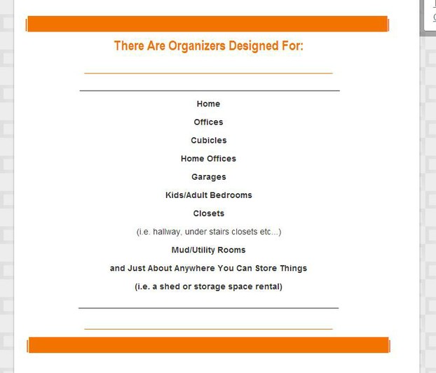
Too much bar but being centered INSIDE a text capsule (not in a title bar) gave off this effect of a middle separator!

n
g
b
h
c

Article Examples Of Effects In Use On This Page

________________________________


All The Articles The Images Above Were Taken From Are Below:

(to stimulate your creativity feel free to copy me!)
This is a poem I wrote one day when I was at my wits end (overwhelmed by life) and shared on HP hope you like it.
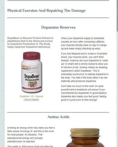
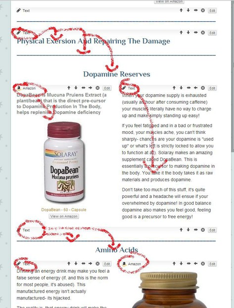
Energy is not just a physical phenomenon created by food and external resources like caffeine and energy drinks, it's a state of mind and an awareness that may change your life
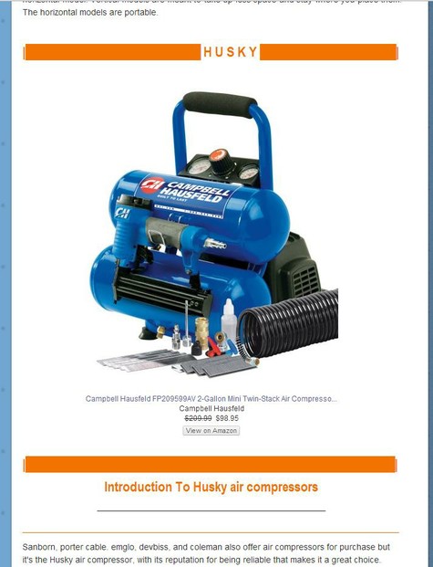
Many don't realize that a true Poltergeist is not a ghost, nor is it something following you around and pushing you into things or causing you to feel jinxed- It's actually Focus..
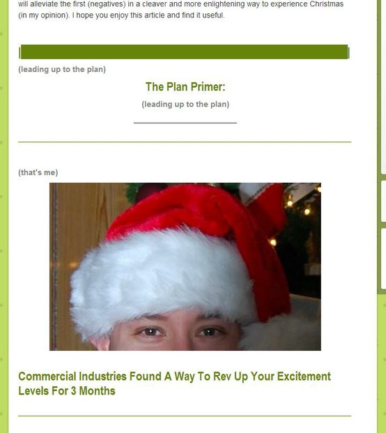
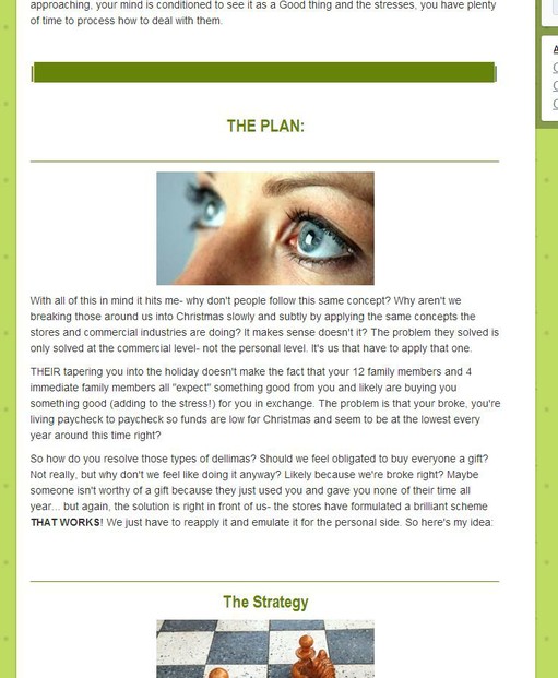
Need a cleaver way to ramp Christmas spirit up so by the month of December everyone is JUICED UP?
I've always, for as long as I can remember, been an entrepreneur. Join me in my adventure from 9 years old when I cleaned houses to my blow pop empire in the 7th grade and beyond!
Regrowing Teeth Is Not Just An Anomaly, It's Actually Something Our Body Has Always Been Capable Of But Some Evolutionary Processes And Our Way Of Life Has Retarded This Ability
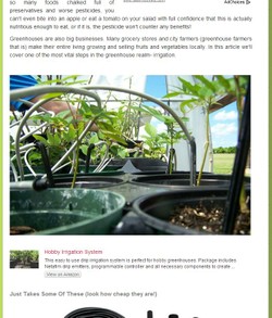
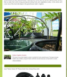
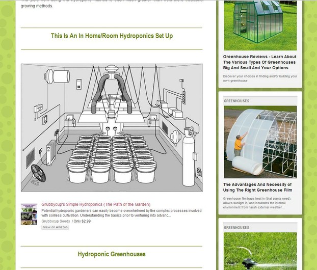
If your looking for greenhouse irrigation methods and resources you're in the right place!
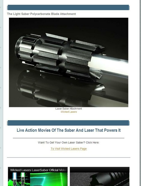
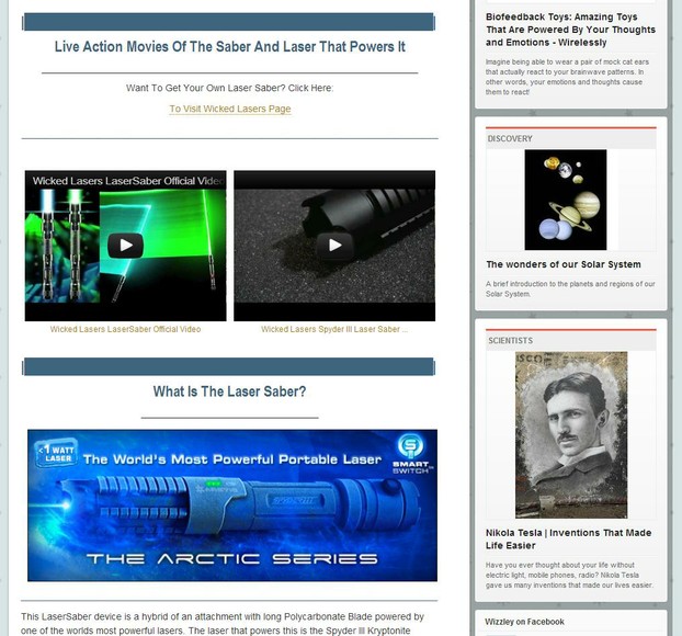
The leisons of Star Wars fans will be glad to know that a real light saber device has been created and is just as lethal
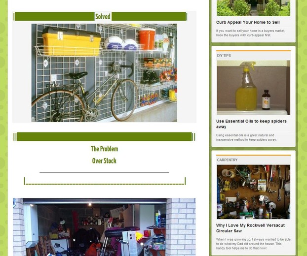
Garage organizer reviews covering types, availability, use, convienience
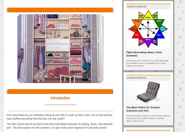
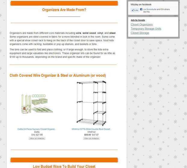
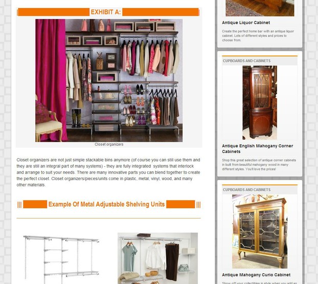
Closets become the haven for all of our "unsorted" items. Learn how to get rid of the clutter and create a closet of the gods
Don't like the taste of Alcohol, lemons, sour vegitables, sour fruits? Take this berry and they will all taste sweet as rasins!
Review and discussion about the popular Rion Professional Greenhouses. Covering several models and their characteristics. Resources also inside.
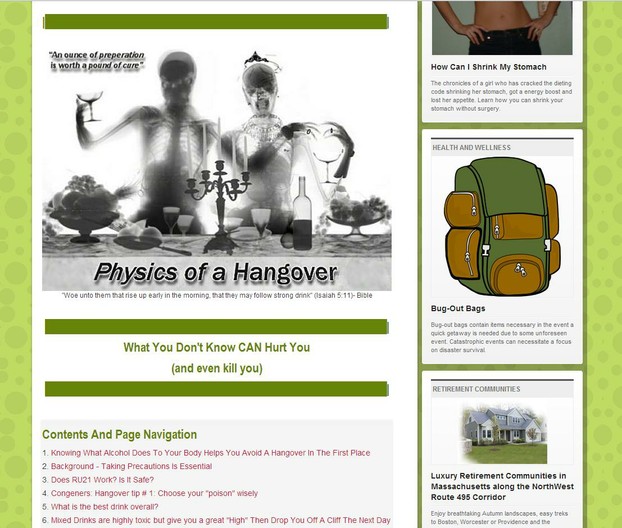
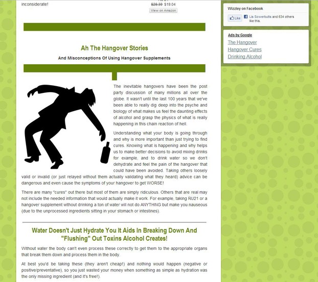
The Intimate Journey of what a hangover is, how it works, and what to do to relieve the symptoms and preventative measures (and debunking the ridiculous rumors of voodoo cures)!
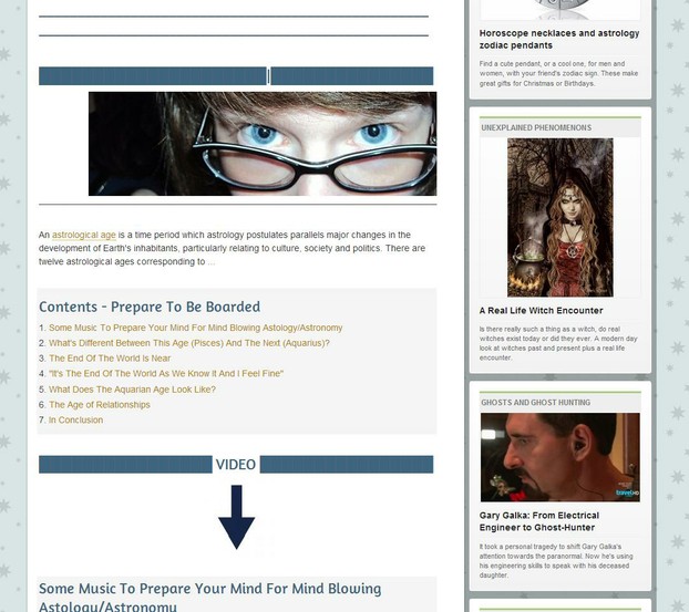
Listen to the song in the video (below) BEFORE You Start Reading To Primer Your Mood For A Hypothetical Journey :) Into The Next "Age"- The Relationship Age or "Aquarius"...

For Some Great Image Tricks Check Out This Wizzley Article:

Updated: 11/19/2012, Jerrico_Usher
 
Thank you! Would you like to post a comment now?
4

Comments

Only logged-in users are allowed to comment. Login
Jerrico_Usher on 11/23/2012

Awesome.... I have some new ones but haven't had a moment or desire lol, to create updates to this page (you can just look at my other articles to see them- I try to learn new formats every time...

katiem2 on 11/22/2012

This is fantastic information. I'm so stoked to learn how to use the lines, page breaks and what not. Put me down for this class as I will be returning often to absorb all the great and helpful tips to "G" up my revenue sharing pages. I like what you said about pleasing both sides of the brain. This is so true and impacts the visitor instantly upon arriving determining if the stay or go. I like the way you think. :)K

JoHarrington on 10/03/2012

Nice tips! I'm bookmarking this for future use. Thanks!

You might also like

Tips and Tricks After 500 Pages on Wizzley

The traffic is down, but the sales are up! And here I am with half a millenn...

Tips and Tricks After 400 Pages on Wizzley

After a year on Wizzley, I've amassed a lot of articles which are starting to...


Disclosure: This page generates income for authors based on affiliate relationships with our partners, including Amazon, Google and others.
Loading ...
Error!